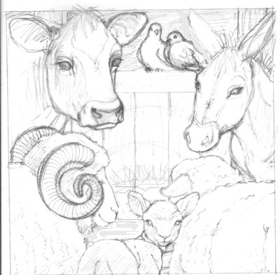
I altered a little digitally after looking at it on my computer screen (moved the manger higher up. Moved a donkey ear, etc...). This one is not correct value-wise: It will hopefully be quite dark in the background with a 'glow' over the manger, lighting the animals noses...
Any other compositional issues? Anatomical?


3 comments:
Hi again,
Does the Donkeys right eye look a little squinty to you?
Big empty spot in middle could be aleviated by making foreground animals larger so left sheep overlaps is it hte donkey (I hate that I can't see the pictures while I am commenting) baby seems disjointed. I think it is his hips are too snmall and his shoulders dont seem to overlap his head. remember sonsecutively diminishing cylinders.
I like all but the donkey and a detail on the ram's face: can you poke his nose forward a tad so that his eye is not obscured by his horn? The donkey's face needs some work: the perspective is off especially the way the nostrils do not curve around his nose and eyes around face. If I could get together with you, we could redraw it.
Suzy
Post a Comment