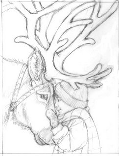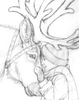
And the same format - but cropped in further:

What do you think? I like the cropped in one better for framing the child's figure, but I miss all the antlers. The larger one has too much dead space to the right of the figure... I could maybe put snowflakes there, but still...? Also, is the kid too squishy-feeling? (I think, now looking at it, that his shoulder/scarf is raised too high -makes him too hunchy-shouldered feeling...?)
Thoughts?


4 comments:
I like the close up one too! It's more intimate, just like the subject matter. The antlers are too busy and I don't miss them.
I love the cropped one--truly warm and lovely. We supply the rest of the antlers automatically--they are not nearly as important as the overall feeling. No problem with the shoulder personally.
Croppped one definitely. :)
I like the cropped one too, the reindeer looks great. There is something a little bit hunched about the boy. Maybe if his hands were holding the reindeer's nose more, so we would see more of a mitten shape from our point of view. Then his shoulder could relax down slightly. Now the hand is positioned as if it was pressed against a pane of glass. At this point it's minor tweaks...by the way , your new web posting looks wonderful! Kathleen
Post a Comment