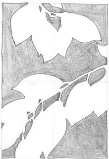

These are the non-map looking foliage-negative-drawings. (also much simpler to do). The nice thing about really focusing on negative space is how it strengthens and unifies nearly any composition.
And it just looks cool! :-)
p.s. Find for the day: Trader Joe's Triple Ginger Snaps (crystallized, fresh and ground). Yum! Fabulous tea accompaniments!


4 comments:
Fun exercise, very strong graphically. This would be a fun idea for my teenagers in the art club.
yes, it does look cool! I'll try this soon
This is the kind of Really Useful exercise that I never find time to do any more...memo to self. Make time.
Really does look cool!
Post a Comment