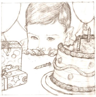
This is my latest version of this self-promo sketch. Let me know if there is anything problematic...
4 comments:
Anonymous
said...
Hi Tara, Gudurun here. Cute pic with lots of "story" Not the third color comp. Both of others good except second could use a little blue for "cleaning". I'd enlarge the upper right balloon so it is overlapped by the head and candle (now right and left too equal, and right seems too small inorder to be that way). A trail of crumbs and if you can pull it off , his tongue sneaking a crumb off the upper corner of his mouth. all for now. do you still need comments on your classes. Sorry things were too crazy at that point to concentrate on writing. G
Hi Tara, First, thank you SO much for your lovely comments about my show--it wouldn't be what it is without all of the POBL critiques, prodding, pushing and encouragement that was behind me.
On to the work at hand. I prefer the primary palette--but this is always my fist choice. The warm is fine, but the third is definitely too cold.
In the B&W sketch, I felt the need for a candle or something pointing into the picture in the bottom left or bottom lef-middle, but I don't feel the need as much in the color, especially in the first color sketch, where the shadows are more clearly defined and the table feels less like one more flat large area like the face.
I love Gudrun's trail of crumbs and think I agree about the right balloon--just worried about too much blue, keep some yellow in there around the ear--maybe just overlap towards the top of the head.
OK - balloon is fixed. And it's staying yellow around his head. (Suzy calls it a 'halo'. :-).
Am working on crumbs. Suggestions for chocolate colors? Jo - you said something about Indian red and Indanthrone blue (which I don't have). Any other chocolate suggestions?


4 comments:
Hi Tara, Gudurun here. Cute pic with lots of "story" Not the third color comp. Both of others good except second could use a little blue for "cleaning".
I'd enlarge the upper right balloon so it is overlapped by the head and candle (now right and left too equal, and right seems too small inorder to be that way).
A trail of crumbs and if you can pull it off , his tongue sneaking a crumb off the upper corner of his mouth.
all for now. do you still need comments on your classes. Sorry things were too crazy at that point to concentrate on writing. G
Oh so sweet, I like it like it is...
Hi Tara,
First, thank you SO much for your lovely comments about my show--it wouldn't be what it is without all of the POBL critiques, prodding, pushing and encouragement that was behind me.
On to the work at hand. I prefer the primary palette--but this is always my fist choice. The warm is fine, but the third is definitely too cold.
In the B&W sketch, I felt the need for a candle or something pointing into the picture in the bottom left or bottom lef-middle, but I don't feel the need as much in the color, especially in the first color sketch, where the shadows are more clearly defined and the table feels less like one more flat large area like the face.
I love Gudrun's trail of crumbs and think I agree about the right balloon--just worried about too much blue, keep some yellow in there around the ear--maybe just overlap towards the top of the head.
Good girl!!!!
Jo
OK - balloon is fixed. And it's staying yellow around his head. (Suzy calls it a 'halo'. :-).
Am working on crumbs. Suggestions for chocolate colors? Jo - you said something about Indian red and Indanthrone blue (which I don't have). Any other chocolate suggestions?
Post a Comment