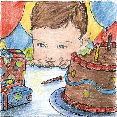
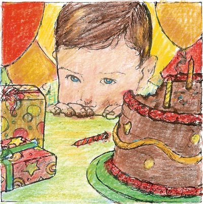
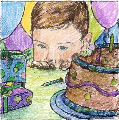
Thats a great angle to have the picture. Can't decide on which colours I like best. The top seems a little cold. The middle is lovely and warm and brings the boy to life. The bottom on though brings him to life and gives a little mystery. Its really hard deciding on colour. I have been sugested that I need to try out differnt colour cats, for my cat problem.
I like the middle color study, the warm colors are really pleasing and unified. I am losing the story a little though, it seems as if the boy should have a little more emotion on his face and there could be a couple of bigger chunks of the cake on the table near the boys hands.
I also prefer the middle color comp, I like the warm color of the balloons in the background. The icing on the face looks natural in all of them...not easy to do!In this latest sketch you do not have the his nose squished down on his hand, something that I thought gave alot of personality to the first sketch.
Tara - I also like the middle warm color combo and thinks it sets off the face where the expression is key to understanding what happened. The candle is key too. I like his guilty look! How did you do that? As Michelle says, if you can intensify the look a bit more it would be good, and a few cake crumbs wouldn't hurt.
Thanks for all of the input. The other color factor I forgot to mention is that this piece will be in Black Book on my agents' page - which has a purplish-periwinkle background - so I think the middle one will have to be the color of choice. (It looks better on periwinkle than the primary one does). Rebecca - I will probably make the plate a blue-green (also the shadows - blue-greens) - but I don't want to introduce any straight blue.
I appreciate all of your opinions, thoughts and ideas!


8 comments:
Thats a great angle to have the picture. Can't decide on which colours I like best. The top seems a little cold. The middle is lovely and warm and brings the boy to life. The bottom on though brings him to life and gives a little mystery. Its really hard deciding on colour. I have been sugested that I need to try out differnt colour cats, for my cat problem.
I like the middle color study, the warm colors are really pleasing and unified. I am losing the story a little though, it seems as if the boy should have a little more emotion on his face and there could be a couple of bigger chunks of the cake on the table near the boys hands.
I also prefer the middle color comp, I like the warm color of the balloons in the background. The icing on the face looks natural in all of them...not easy to do!In this latest sketch you do not have the his nose squished down on his hand, something that I thought gave alot of personality to the first sketch.
Tara - I also like the middle warm color combo and thinks it sets off the face where the expression is key to understanding what happened. The candle is key too. I like his guilty look! How did you do that? As Michelle says, if you can intensify the look a bit more it would be good, and a few cake crumbs wouldn't hurt.
Definitly the primary one, it seems more kid-like...
Middle one. Colours are gorgeous. :)
I like the middle one,with all the warm colors,except with the plate switched to blue.
Thanks for all of the input. The other color factor I forgot to mention is that this piece will be in Black Book on my agents' page - which has a purplish-periwinkle background - so I think the middle one will have to be the color of choice. (It looks better on periwinkle than the primary one does). Rebecca - I will probably make the plate a blue-green (also the shadows - blue-greens) - but I don't want to introduce any straight blue.
I appreciate all of your opinions, thoughts and ideas!
Post a Comment