

I was actually kind of proud of myself using forced 3-point perspective (I am so 'spatially challenged'- I have to really work at different perspectives). I thought this fun and dramatic. Apparently *too* fun and dramatic. Here is the asked for revision:
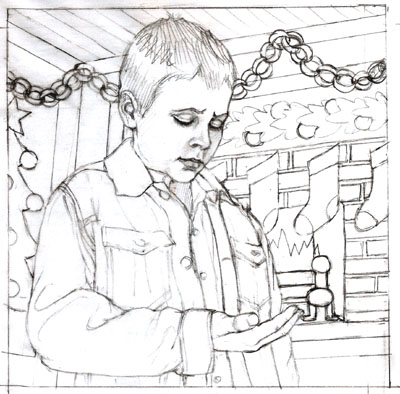
OK - any other thoughts on the second version? It's supposed to be a Christmas time, period (circa 1940s vaguely), class-room setting. The first sketch featured a blackboard, but I thought that would be not as interesting in the second version, as more of it showed, so opted for a 'bulletin board' instead?...


12 comments:
hmm, I can kind of see why they didn't go with the first one, not that I think there's anything wrong with it, but it does seem a little threatening with the dramatic perpective. The second one is 'safer' but seems much more suitable, and I really like the decorations.
Agreed, the second one works better in this context. The dramatic angle of the first sketch would be more appropriate if something truly traumatic were happening. (I love that kind of perspective, though, too!)
I wouldn't call the first one threatening -- but it does dwarf the viewer. Personally, I think I prefer it, though the second works really well, too. As for looking like a 1940s classroom, I would ask someone who went to school at that time if the kind of decorating that you've seen in classrooms in the last 30 or so years existed then. I have a suspicion that it's a more recent phenomenon, but don't quote me.
In the first picture I envision him saying in his mind 'Hey cool', like he's dead chuffed with whatever is in the palm of his hand. In the second picture he looks disappointed with what's in the palm of his hand. What's the story, how's he supposed to be feeling?
Thanks for the feedback guys:
Andrea - I'm sure you're right about the decor - however, she wanted it really 'christmasy' feeling (it is supposed to be a cut paper bulletin board behind him on the right. Paper chains overhead. Cut paper 'poster' kind of thing on the left). I wonder what they *would* have had, Christmas-wise for decor then?
Weirdbunny - he's supposed to be looking concerned/sad/embarrassed by the 'meagerness of his offering'. (He has 15 cents in his hand to add to the 'gift box' for the orphanage).
I like the first one, much more interesting to look at I think. This probably means that the second one is more commercial. I am always drawn to things that are different, in my work its the images I dont like, the safer illustrations, that usually sell.
Penny.
I'm wondering if the fireplace makes the scene a little confusing, I understand it's supposed to be a fake fireplace decoration, but it doesn't feel like a classroom to me. Good compromise on the boy.
It didn't say classroom to me, I think because of the ceiling height is a little low and cozy. My old school (in the 60's) had high ceilings and those flourescent lights that we hung decorations from. The paper chain going right behind his head is a little diturbing, but I know when you do the color it will be softer and less dominant. Maybe we'll get to see that dramatic perspective in something else soon!
Well I liked the first one...but you have to do what the client wants, mores the pity, funny isnt it, wonder how they would feel if we told them how to edit, or write!
If he's sad and embarrassed it has to be the second sketch then. Thanks for answering the question.
What a great blog! I love your floral photography, and you really are a great draughtsman (? draughtswoman? draughtsperson).
I know what you mean about in-depth research. Years ago, I was commissioned to illustrate 'The Water Babies', which involved lots of research into Victorian social history. In the end I still kept up my reading when I finished the commission!
Wow that really is some serious 3D looking work. Ilove it. I like how his eyes are mcuh deeper than the rest of the scene. I really like your use of negative space, you are such a talent.
Post a Comment