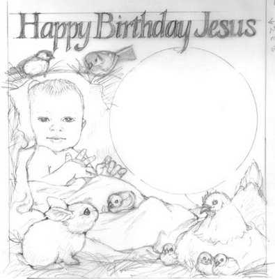
Let me know what you think about this one. The 'chickadee' (if that's what the birdies on the top end up being. Will depend on what color I need) on the upper right is a little too big compared to the left one. How about compared to the chicks? I think they are all bantys. :-) (Or is it banties - plural?)
Can I get away with the baby sitting up so vertically?


6 comments:
Hi Tara,
Cool blog! Maybe the baby is a bit too "sitting up" for a baby. Does anyone else think the chicks look too tiny?
Rebecca
Hi Tara, I agree that the chick are a little bit small and maybe the (right)chickadee is a little bit big, but you do not want to have both chicks and chickadees the same as each other. The baby looks a little bit upright, can you have him leaning back, rather than to the side? He would still be upright ,but you would see both ears and shoulders. The cover sketch looks really good. Hope this works! Kathleen
Yeah - I think the chicks are too small. So if I make them bigger, then maybe the chickadees on top end up being slightly bigger birds? Sparrow sized maybe?
And now the bunny head is looking huge to me as well! *sigh*
Hi Tara,
I also feel the baby is just a little too upright. I love the composition. I think that only the chick sitting on the blanket is too big--it is further back in space than the other ones, so it should be smaller. I think adult chickadees would be a drop bigger than baby chicks--a Suzy/Kathleen question. I agree that the right one looks too big but the left feels fine. Baby bunny heads probably would be bigger than adult size heads relatively. Very cute bunny-don't change it.
On the Beasts cover, This is picky, because overall it works just FINE for this project. However, I am still a little bothered about the donkey. Could you redo (ah, how easy for me to say!) him so that he is in profile, reaching over to the dove, maybe fixing that dead space of cow and donkey chests in the bottom left and connecting two animal sections? Maybe making him a little tiny bit shorter. But feel free to COMPLETELY ignore this.
Looking wonderful!!!!!!!!!!!!!!!!!!!!!
Jo
Jo
Beautiful sketch , Tara!
The chicks are small, but I don't mind them that way, I think you should leave them as they are. I agree Baby should recline a bit if possible. I also don't mind the bunny head being a bit big because she is sooooo cute!
Suzy
Your work looks really good:), I like that are putting it online now.
Ross
Post a Comment