OK, ok, I'm finally posting about the painting I did at the
workshop.It started with choosing from a list of book cover '
assignments' supplied by
Irene Gallo - all from actual books being put out by
Tor. The topic I chose was "Plant Life" - the description being
"A human figure that mixed some aspects of a plant life -- it could be fantasy or science fiction. It could be a mix of human plus weeds, moss, flower, vines, etc. Still, a strong emphasis on the human form." After spending the last two years doing twinkly flower fairies and sweet little garden gnomes exclusively, I decided that I wanted to do the 'evil' version of a garden gnome. What if Baba Yaga had a garden? What would it contain, and what would her garden gnomes look like? After a couple of blissful evenings researching 'scary plants', I started doing some very rough thumbnails of something that would work for the format of a book cover.
 See? Rough!!! But that's usually how I work out the compositions to my paintings - large, scribbly shapes and value - only decipherable to me - to help me visualize the best way to put the picture together. Most of my thumbnails are not much more specific than this.
When I have the composition basically worked out, I start gathering my specific reference and begin a series of drawings on tissue paper so that I can just keep laying a new one on top - keeping what already works, and refining or changing what doesn't. It's gotten so that I rarely draw on 'real paper' any more after the thumbnail stage. I also kinda love the ultra smooth surface of the Canson tracing paper that I use. When I have the details fairly resolved, I blow it up to whatever the finished painting size is to be and fix or resolve anything else that needs it.
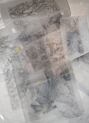
(Stack of various versions of the drawing on tracing paper)
This is what stage I was at when I went to the Master Class. After our first lecture the first morning, we all trundled over to the studio and tacked our sketches up on the wall for our first critique. It was just like school all over again, as your piece was dissected by the faculty and all the students look on (and in this case, the faculty in question was Boris Vallejo and Rebecca Guay. Boris Vallejo was my critiquer!!! And guess who was the first student up to be critiqued? You guessed it - moi!)
The vast majority of the attendees were painting Serious.Scifi. Neither staff nor students really quite knew what to make of me or mine (the only middle-aged, children's illustrator who was doing a whimsical rather than a Serious Piece in attendance). I got a lot of people walking behind my easel who would pause and go..."huh....mmmm...............nice....?"
Anyhow, Boris, in the nicest possible way, pointed out all the ways that my anatomy and perspective kind of sucked. ("Other than that, it's a very nice piece"...) I felt a bit panicked at first since all of my usual resources - my camera and printer, my laptop and Google Images - were not at my disposal as usual. In my ultra-exhausted, jet-lagged state, I was almost ready to throw up my hands in despair at my lack of ability and resign myself to only watching the demos and listening to the lectures rather than trying to draw... Tearfully seeking reassurance from a fellow-critique-member from home that night, I happened upon a solution to my anatomy problem (magnified by me doing a non-human figure):
 See late-night, sleep-deprived ingenuity - wadded paper, masking tape and Q-tips! Luckily this was enough for me to be able to see where the far shoulder and pelvis were in space and I was able to salvage my drawing. Got an 'OK' from Boris the next day (and I am happy to report that a good night's sleep resolved a great deal of my angst as well).
I took my newly corrected, full sized sketch to the local copy shop to be scanned and printed out small for value and color comps and large, on heavy paper to paint upon (the coolest, best thing I probably learned all week! But more on that in another post).
 After some experimentation, I worked out a color and value scheme that I wanted to follow - and then I began to paint. Initially in my normal watercolor technique:
 You can kind of see some of the 'scary plants' I chose to include: dragon arum, blood sedge, dead nettle, ghost fern and eyeball plant. :-) (How cool is that!!?) This is about the stage that normally I would consider myself finished. Fairly transparent washes, kind of Rackham-esque. But a large motivation for me going to this workshop was to learn Rebecca Guay's technique of under painting and then continuing with oil glazes on top. So I bravely soldiered on...

After quite a bit of faculty input (it's been about 20 years since I've really touched oil) I pretty much covered the entire painting in oil paint. I will have to go get this scanned since this photo does not really show the cool detail (and doesn't the lighting make ever so much difference? The watercolor version was not significantly different in color-temperature than the oil, but the camera has made it so...)
After my initial learning curve of applying thicker paint to a slick surface (and feeling like a kindergartner) I actually got to really like some of the aspects of the oil - the dark darks you can get, the bright highlights that are *additive* rather than subtractive, the luminosity of the color... I am hoping to do one of my next contracted books with oil glazes.
So there you have it. "Wicked Whimsy" vs. Serious.Scifi.
That's about as far as I go at present.
Next up: My list of The Next Professional Steps I am Taking to Further My Career

 - eventually we refined this to be more of a 'portrait' of the horse rather than a full-body view as the previous covers had been.
 That decided, I did a round of rough mock-ups of all four covers, with varying poses and flora.
 And then some color thumbs to sort out the various palettes and make sure they are appealing as a group.
 Here's the next batch of refining the cover drawing for cover #9 - with a requested pose revision on the right.
 The next round - fairly refined drawing to submit to Breyer for an anatomy check and approval.
 And then a large, clean, refined drawing ready to scan, print and then paint. (Who knows where you can buy translucent drawing vellum by the roll? I'm currently enamored of doing this stage of drawing on that surface, but the vellum I can find by the pad is never quite large enough).


 Posts


